
14 Oct Creating Flow in Open-Plan Homes: Choosing Colours That Work Together
Open-plan living has become a popular approach to modern home design, creating spaces that feel larger, brighter and more connected. While this layout offers flexibility and openness, it can also make colour selection more challenging. Without clear room divisions, wall colours need to work together seamlessly to create balance and flow throughout the home.
With thoughtful planning, it’s possible to create a cohesive palette that defines different areas while still maintaining a unified overall look.
Start with a foundation colour
A good place to begin is by choosing one main colour that will anchor the entire space. Neutral and versatile shades such as soft greys, warm whites, beige tones or muted earthy colours work particularly well in open-plan homes.
Using a consistent foundation colour helps connect different zones, creating visual continuity between living, dining and kitchen areas. It also provides flexibility when introducing furniture, artwork and decorative accents.
Introduce accent colours carefully
Once the main colour is established, secondary tones can be introduced to add personality and depth. Accent colours should complement the primary shade rather than compete with it.
For example:
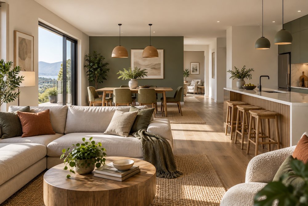
- Warm neutrals pair well with olive green, terracotta or charcoal
- Cool greys work nicely alongside navy, crisp white or soft blue tones
- Earthy palettes can be lifted with muted sage or clay-inspired shades
The goal is to create subtle variation while preserving harmony across the space.
Use colour to define zones
Open-plan living does not mean every wall must be identical. Slight shifts in tone or the addition of a feature wall can help define different functional areas without interrupting the overall flow.
A deeper shade behind a dining table, for instance, can create a sense of intimacy, while a softer tone in the living area may feel more relaxed and open. This approach helps establish distinct zones while keeping the design visually connected.
Consider how light affects colour
Natural light has a significant influence on how paint colours appear throughout the day. Rooms with strong natural light can often handle deeper or warmer shades, while darker areas generally benefit from lighter, more reflective colours.
The direction a room faces also matters:
- North-facing spaces tend to receive cooler light, which can make colours appear softer or slightly muted
- South-facing areas usually enjoy warmer light, enhancing warmer tones and adding richness to colour
Testing paint samples at different times of day can help avoid unexpected results once the room is finished.
Add depth with texture
Texture is another effective way to bring warmth and interest into an open-plan home without introducing too many colours. Textured finishes, wallpaper, timber detailing or subtle render effects can create variation while maintaining a cohesive palette.
Even simple changes in finish, such as combining matt and low-sheen surfaces, can add depth and sophistication to a room.
Keep the overall palette balanced
One of the most important aspects of open-plan design is restraint. Too many competing colours can make a large space feel cluttered and disconnected. Sticking to a consistent palette with carefully chosen accents creates a calmer, more considered atmosphere.
Repeating tones through soft furnishings, artwork and décor can also strengthen the sense of continuity throughout the home.
Bringing the space together with Pelham Painters
A successful open-plan colour scheme should feel effortless, even though it often requires careful planning behind the scenes. By selecting a versatile base colour, layering complementary tones and considering the role of light and texture, you can create a home that feels cohesive, comfortable and visually balanced.
Pelham Painters in Hobart can help you define the right combination of colours that allows each area to maintain its own identity while still feeling part of a larger, connected space.